
The full story
A live command screen for teams that must make high-stakes calls fast.
The task
The client needed a new work screen. It had to show a large amount of live data to teams in a fast-moving setting.
New tools had been added to the old screen over time. Staff had to search through too much split data on too many screens.
Each search used more time and more mental effort before a call could be made.
This was not just a new dashboard look.
It was a way to make hard live data quick to grasp.
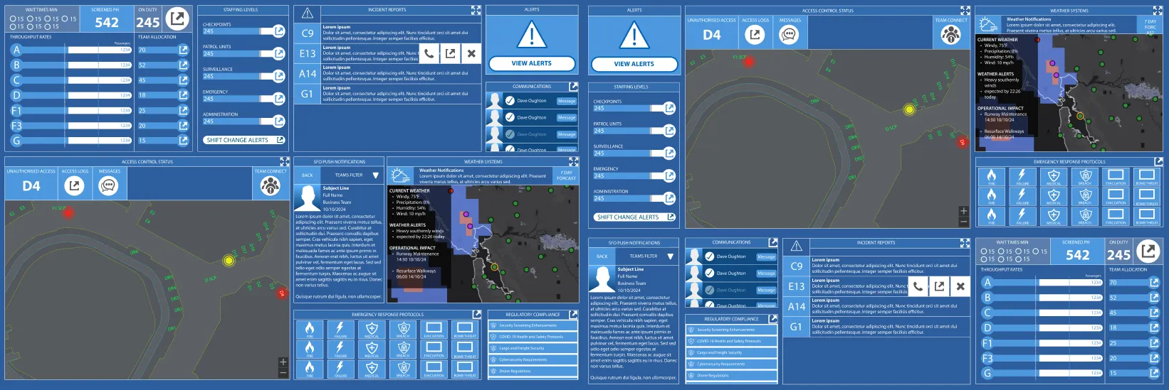
A tool for active work
A live work tool is not a sales website.
The users watch events, people, supplies, alerts, live state and weather. They are there to do a job, not browse.
Their calls can affect hundreds or thousands of people.
A poor screen choice can slow the work.
So clear use came before visual flair.
How we worked
Watch the real work
Before we drew a screen, we studied how staff used the old tool.
We looked at actions before colour and layout.
We asked:
- What do staff check first?
- Which alerts need action now?
- What must stay on screen?
- Which actions happen most?
- Which screens make staff jump back and forth?
- What slows the next call?
We began the screen design after we knew those work paths.
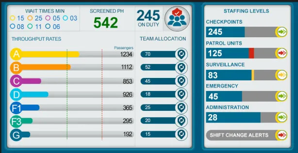
The new command view
The new dashboard puts easy use, fact order and quick calls first.
It brings many work systems into one clear frame. Teams can watch live work with less screen noise.
- Live work dashboard
- Event care screen
- View of where people and supplies go
- Staff and flow charts
- Map that staff can use
- Live weather data
- Message panel
- Alerts in order of need
- Full-screen and tablet views
- A short, clear menu
Screen rules
Each screen choice came from how people act under load.
Facts were grouped by how much they matter to the work.
Common actions stayed close at hand.
Colour marked a real change in state. It was not just for show.
Large sets of live facts went into set zones. Staff could learn where to look each time.
The new screen felt calmer even when it showed more facts.
The result
The final design gave staff one clearer place for hard day-to-day calls.
In team demos, people praised the clear order and the way it showed a lot of live data without too much noise.
The work showed how a well-planned screen can support quick, sure calls.
This case uses what the design can do, not sales numbers: one dashboard, live views, screen-size support and clear charts for dense data.
What we made
- Study of user needs
- Maps of each user path
- A clear order for all facts
- Simple page plans
- Dashboard design
- Shared design parts in Figma
- Layouts for each screen size
- Shorter work paths
- Screen tests people could click
- Sizes and rules ready for coders
Skills used
- Live work dashboard
- User design for a large team
- Clear fact order
- High-stakes screen design
- Design for each screen size
- Clear data charts
- User path plan
- Design based on real people
What we learned
A live work tool does not win just by looking bold.
It works when a person can see what is going on and choose the next step.
The screen should stay out of the way so the team can focus on the job.
The key point
A clear screen can hold a complex system behind it.
This project was not just about a better look.
It was about helping people make a clear call under strain.