
m|devices – We redesigned, restructured, and reimagined their digital presence from the ground up.
Transforming a medical brand with precision web development, targeted SEO, and performance-driven advertising.
Built for clinicians. Optimised for outcomes.
Case Study: Elevating a Medical Brand with Strategic Digital Execution
m|devices – Web Development, SEO, and Paid Media Partnership
Sector: Medical Devices – Continence, Airway Management, Venous Access
Location: Australia
Client Since: November 2024
Services: Web Development, SEO, UX Redesign, Digital Advertising (Google & Meta)
About the Client
m|devices began as a small, family-run medical device business in Australia and has since grown into a nationally recognised leader in clinical design and manufacturing. For over 15 years, the company has focused on creating specialised medical devices tailored to the specific needs of Australian clinicians, particularly in the fields of continence, airway management, and venous access. Their commitment to collaboration with healthcare professionals, embedded directly into the design process, has earned them trust across the healthcare industry. Known for their “Leading by Design” philosophy, m|devices stands out for combining clinical insight with precision manufacturing.
Project Goals & Initial Challenges
Key Challenges:
A previous design agency failed to meet the client’s expectations for a new website.
Low visibility in search due to weak SEO architecture and outdated content.
Underperforming digital advertising campaigns with poor conversion rates.
The existing website lacked structure, visual appeal, and a clear user journey.
The new B2C section required distinct UX and navigation strategies for a broader audience.
Success Criteria (from Client's Viewpoint):
A modern, future-proof website aligned with brand identity and clinical excellence.
Stronger SEO structure to improve search rankings and traffic.
Improved performance of paid ads with better ROAS and lead quality.
A clean, user-friendly design that works for both clinical and consumer users.
Real-time tracking and reporting for continuous campaign optimisation.
Scope of Work
Website Redesign & UX Overhaul
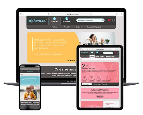
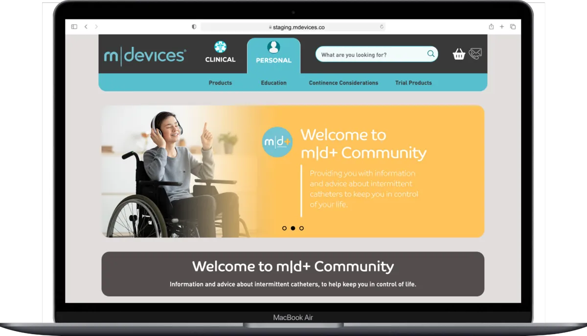
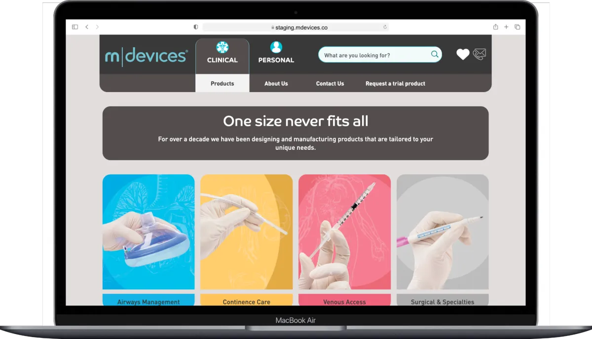
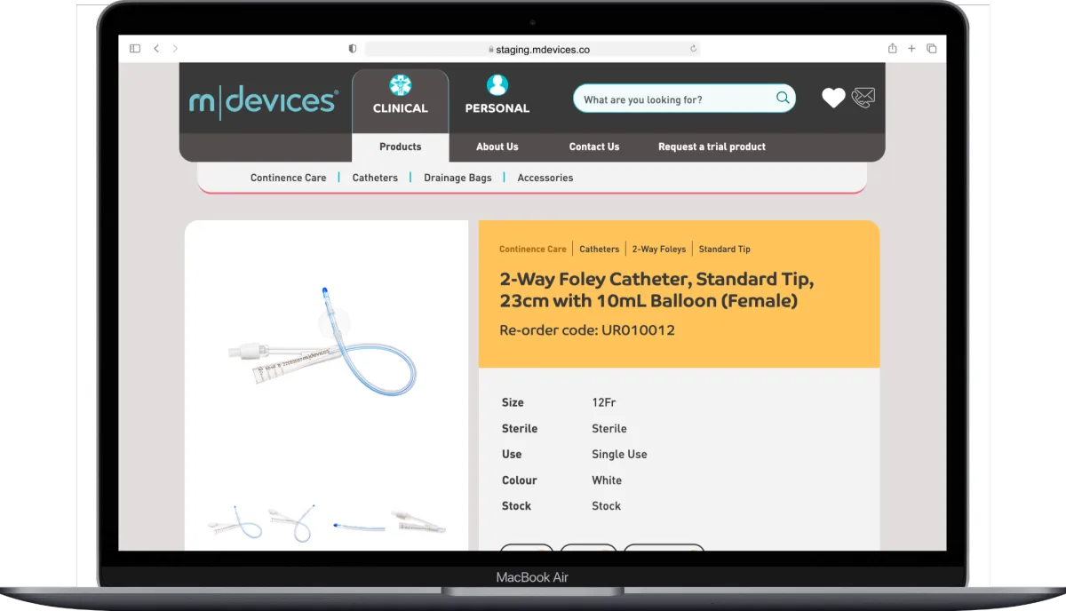
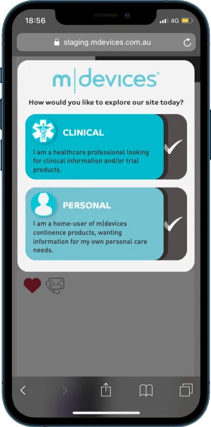
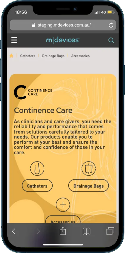
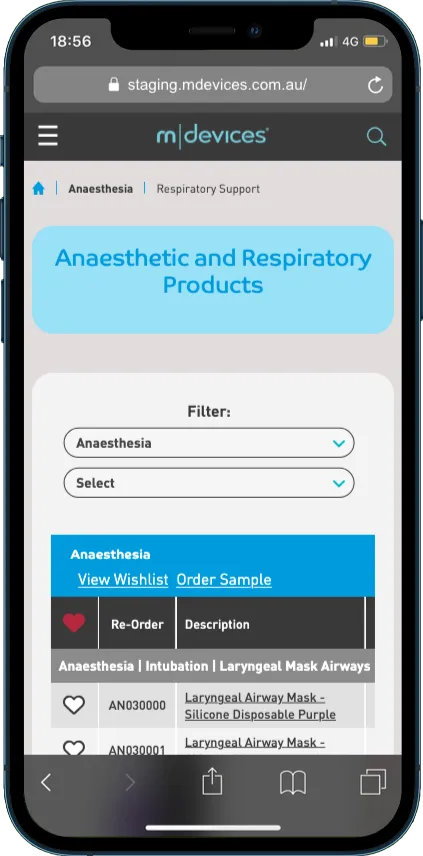
We redesigned the m|devices website from the ground up using Umbraco, implementing a completely refreshed visual language, updated image styles, and custom iconography. The user journey was simplified, and a mega menu was introduced to clearly navigate the site’s growing product catalogue and newly added B2C section.
SEO Strategy and Content Structuring
A structured content and metadata framework was introduced to optimise each page for relevant search terms. We focused on indexing key product and category pages, improving crawl depth, and eliminating technical SEO issues that were suppressing visibility in search engines.
Digital Advertising – Google and Meta Campaigns
We rebuilt their ad strategy from scratch, focusing on precise audience segmentation, creative enhancement, and continuous testing. The campaigns were designed to generate qualified leads while maintaining tight budget control, resulting in higher conversion rates and improved ROAS.
Real-Time Performance Tracking
We implemented an analytics and tracking suite to monitor everything from ad performance to user behaviour across the site. This data-driven approach enabled us to make iterative improvements to both UX and advertising strategy based on real-world usage.
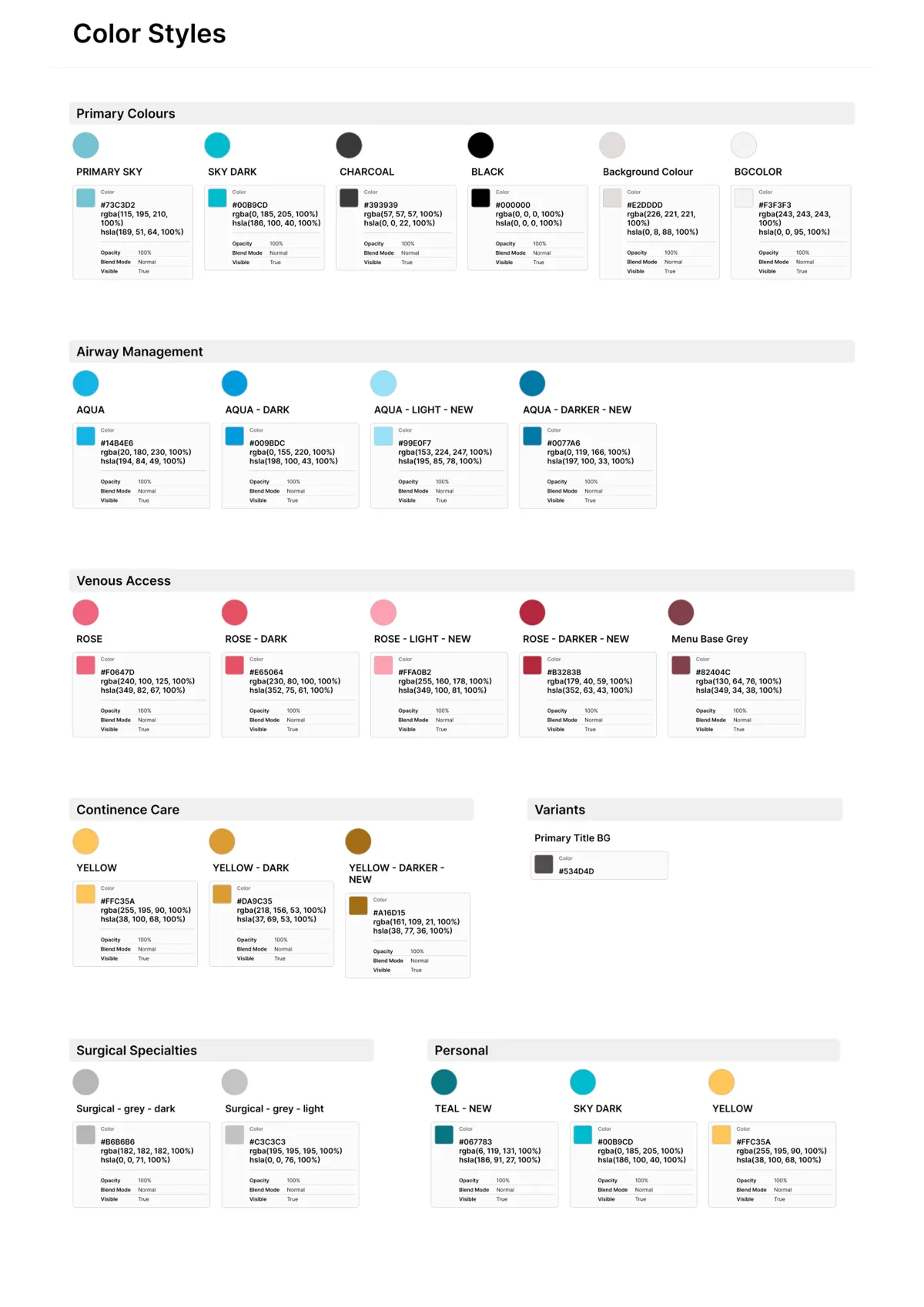
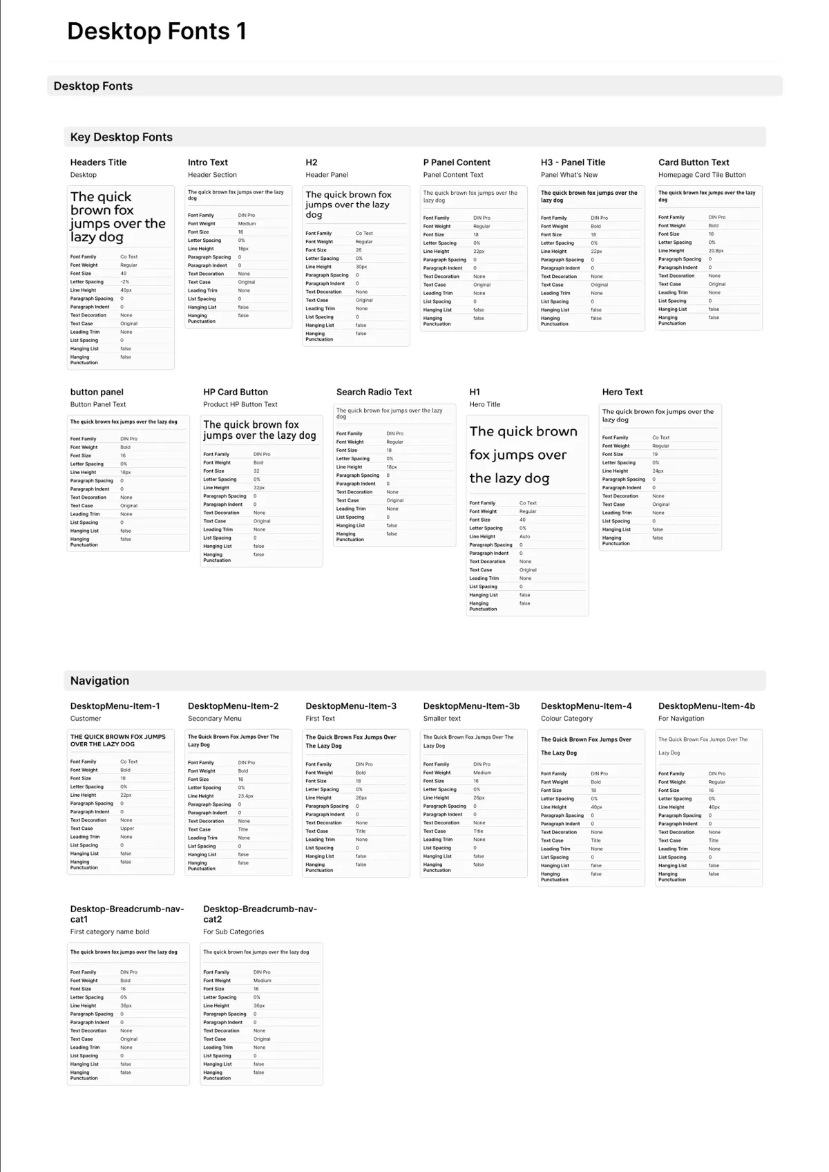
Brand Refresh and Visual Consistency
The design refresh was not just cosmetic—it included a new colour system, updated image treatments, and defined visual guidelines that ensure consistency across future content and development updates. This makes the site future-proof and easier to manage for internal teams.
Future-Proofed Navigation & B2C Integration
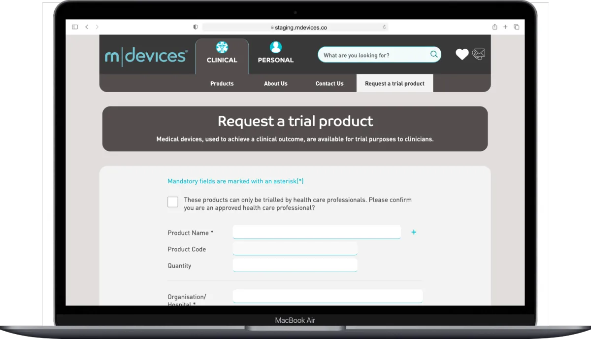
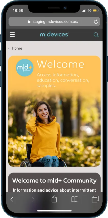
The introduction of a clear, customer-friendly B2C pathway was critical. We designed user flows and navigation logic specifically for consumer engagement, including simplified ordering features and content tailored for non-clinical users, without compromising the professional tone expected by medical buyers.
Key Results
Increased Website Traffic and Engagement
Content marketing, SEO, and ad campaign improvements led to a significant uptick in overall site traffic. More importantly, users were staying longer and engaging more meaningfully with product content.
Stronger On-Site Behaviour Metrics
Thanks to UX and content improvements, session durations increased and bounce rates dropped. Visitors were navigating more pages per session and interacting more confidently with both clinical and B2C sections of the site.
Improved ROAS and Ad Performance
Paid advertising became far more efficient, with higher-quality leads generated at a lower cost. The new ad creative and targeting strategies helped drive a better return on ad spend and improved lead-to-conversion ratios.
Client Satisfaction and Long-Term Partnership
After a disappointing experience with a previous agency, m|devices was thrilled with the outcome of the partnership. The new site is set to go live shortly, and we remain engaged in an ongoing support and optimisation role.
Designs
Start with Figma Designs
This enables the developers to gauge all elements required, from fonts through to colours, this is imperative for the development process to be easy. Each section is broken down into pages.
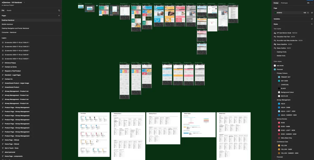
The Design is moved into Staging Development Server
Technical Highlights
Accessibility-First Visual Design
Accessibility was a core consideration in every design decision. We worked closely with WCAG 2.1 guidelines to ensure the site was usable by clinicians and patients with visual impairments. This included the use of high-contrast colour combinations, larger tap targets, and legible typography across all devices. The new colour palette was tested against contrast ratios to ensure compliance, and iconography was designed with clear shapes and universal meaning in mind. Additionally, alt text, ARIA labels, and proper heading hierarchies were implemented throughout the site to support screen readers and improve navigability for users with assistive technologies.
Custom Umbraco Templating and Component Logic
Working within the Umbraco CMS required the development of custom Razor views and partials that balanced flexibility with consistency. Each component was modular, allowing for reusability across different page types without duplicating effort. We built structured document types that mapped directly to content needs and future scalability, including product groupings, landing pages, and clinical resources. This setup enables the in-house marketing team to update content without compromising design integrity, while keeping development clean and efficient.
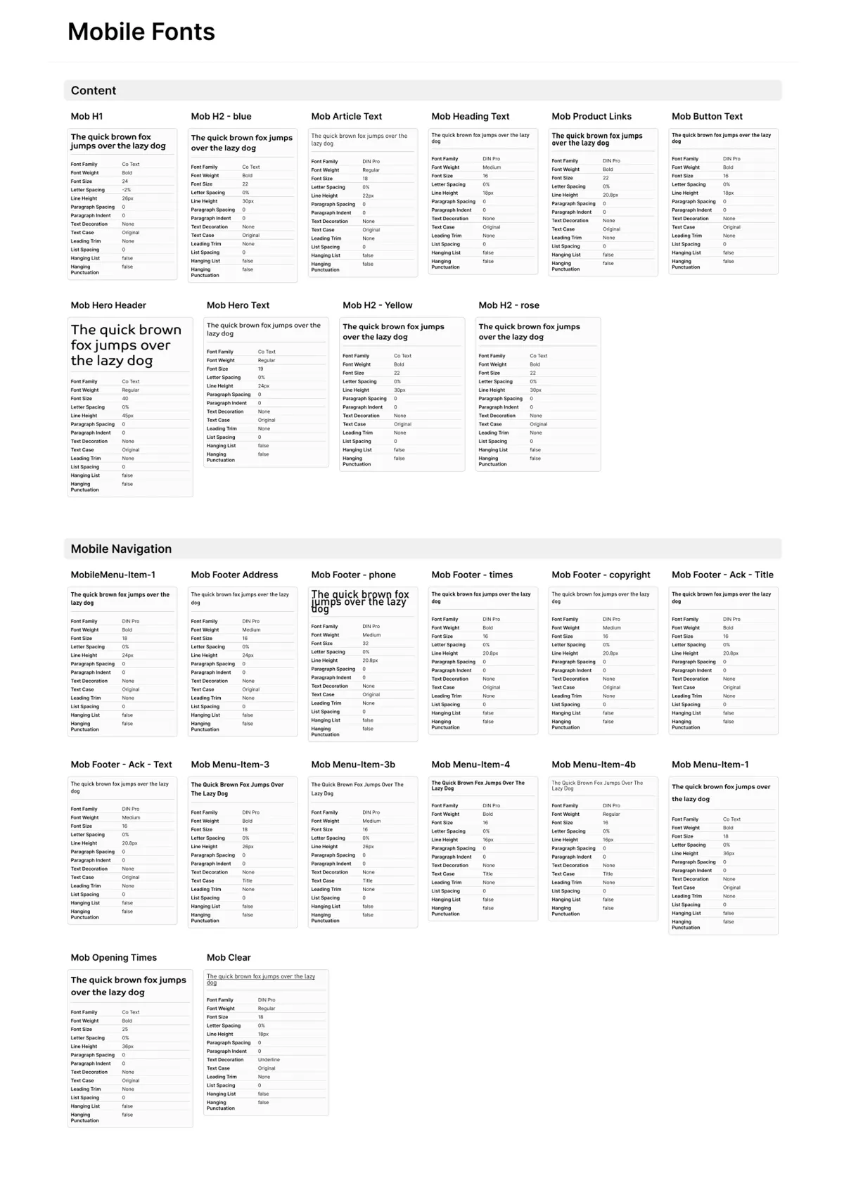
Figma-to-Frontend Precision
Our design process in Figma wasn’t just for wireframing—it was used to create an interactive design system that informed every visual element of the site. Colours, spacings, typography rules, iconography, and reusable UI components were all defined in Figma before a single line of code was written. This ensured pixel-perfect implementation and eliminated ambiguity between design and development teams. It also enabled smooth client collaboration and approvals, with clickable prototypes giving m|devices a tangible preview of the final site.
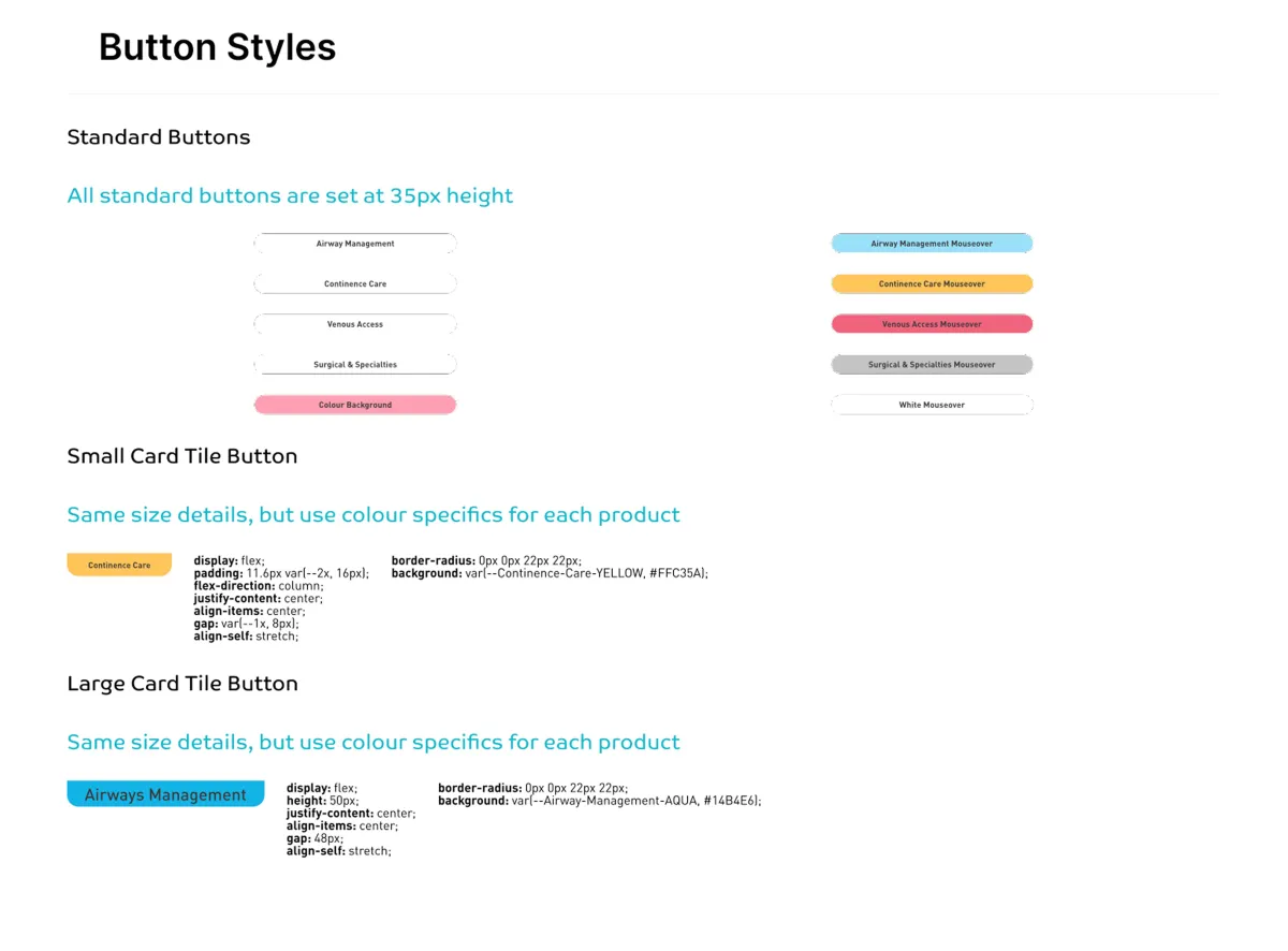
Scalable Style Guide Implementation
Alongside the front-end development, we implemented a custom style guide directly within the CMS to future-proof internal updates. This included global variables for colour and typography, as well as UI behaviour rules (like hover states and button interactions) that remain consistent throughout the site. The documentation makes onboarding new content editors or developers easier and sets the foundation for seamless expansion as the company grows its digital footprint.
Performance-Optimised UI Elements
While visually rich, the site had to perform well across Australia’s sometimes patchy internet infrastructure. All assets were optimised for web performance, with SVG icons, lazy-loaded images, and CSS animation alternatives replacing heavier JavaScript where possible. We also ensured a clean content delivery path by removing redundant CSS and JavaScript inherited from the previous agency’s build.
Have a Project in Mind?
Got questions or ready to get started? Fill out our quick contact form, and we'll respond promptly. You can also reach us directly via email or phone—we're here to discuss your project anytime